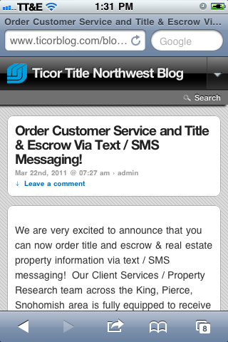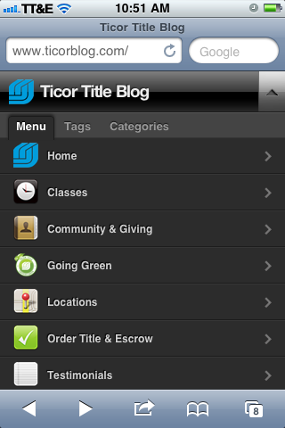
How do I make my wordpress website easier to read on mobile devices? Having the answer to that question has become more important as we have studied smartphone usage statistics and considered our tech savvy real estate client base in the Puget Sound area. In a nutshell, a large portion of our clients (and future clients) are seeing us online through the filter of a 4-inch screen in their hand. And consciously or not, they’re making judgements about us based on how we appear.
Smartphones are about to dominate the market
Have you observed people and their smartphones lately? It seems everyone has one and they’re always in hand. If you remember our recent post regarding Ticor’s ability to receive title & escrow and customer service requests via text, you’ll remember that experts are expecting smartphones to garner the lion’s share of the mobile device market by the end of 2011. And what are people doing all day on their smartphones? They’re doing all the usual smartphone things… They’re texting, calling, gaming, reading emails, using apps, and looking at websites.
The problem of browsing the web via Smartphone
Have you ever looked at a website on a smart phone? It’s quite an experience because you never know how things are going to turn out as you browse from one site to another. Sometimes you get lucky and the website is so simple (like craigslist) that it looks normal on even an old-school blackberry. But even on the latest phones with larger touch-screens, you’ll find websites with strange columns of text or split pictures that appear for no apparent reason, making things very hard to read. And if there’s flash on the site, good luck…

The Good News
We don’t have a solution for the world’s mobile browsing problems. But we do have a solution that we’ve applied to our WordPress site (this site). Back in 2010, at RE BarCamp in Seattle, Mike Mueller shared a few of his favorite wordpress plugins and one of them happened to be a plugin that makes wordpress sites easy on the mobile browser. At the time that was a ‘stupiphany’ for us. Duh! There’s a wordpress plugin for everything. Of course there would be one that would make our site mobile ready!
Since that time, we have tested a few mobile-ready plugins and settled on one called WPTouch that we are very pleased with. It provides a mobile ready look and feel for the most popular mobile platforms and it provides an intuitive set up with options for colors, drop-down menus, individual page icons, and the inclusion or exclusion of pages from the mobile site.
So if you’re a mobile user, we’d love to hear your feedback on how usable our site is on your mobile device. Please share your thoughts by leaving a comment below!